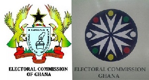
The Electoral Commission (EC) has redesigned its logo and would soon launch it ahead of the November elections.
The decision by the election’s body to change its logo has, however, been met with disapproval from some media practitioners.
The current EC logo has a black star in between two eagles at both sides of a shield with a hand in the middle casting a ballot, which at first sight gives one an idea of what the Commission’s function is.
It also has the inscription ‘Transparency, Fairness, Integrity.
The new logo on the other hand has a black background and it's round in nature with round spots which are green, yellow, white, and red in colour. It gives no idea about the job of the EC at first sight.
Some media practitioners upon seeing the new logo for the first time at a capacity workshop organized by the EC on the November polls queried why the change in logo.
But an explanation by the deputy commissioner of the EC Georgina Opoku Amakwaah that the move is part of a re-branding exercise did not go down well with the participants of the workshop who opined that the new logo looks foreign and charged the commission to revert to the old one.
General News of Tuesday, 12 April 2016
Source: starrfmonline.com


