Engaging the services of an expert that provides interior/exterior décor consultation services, supply and installation of window blinds, wallpapers, home accessories, and horticultural works to enable you craft a design for your home or office that you desire, all we sometimes think about is the aesthetic effect of the design without knowing that it’s only one piece of the puzzle.
One area that most of the time suffers neglect is the philological effect of interior design on your subconscious. Truth be told, the choices that we make when deciding on how our interior environment will look have an effect on our emotions and perceptions.
For example colour of the walls in our kitchen might be contributing to our anxiety or the brand of couch could lead others to assume that you’re reserved.
We would want to make sure that the colour you decide to work with in designing your home interior is giving off the right impression. Therefore we have decided to put together this series to inform you on how to create an interior design that works for you inside and out. By adhering to these concepts, your design will be aesthetically and psychologically pleasing.
It’s no surprise that colour is the main component of how we experience the world around us. But, what may be surprising to some is the fact that the colours in our environment have an effect on our moods and emotions. As you begin to imagine your home’s
Interior design, make sure that you are using colours in ways that fit with the tone you want to create in the space.
Modern colour psychology dates its origins to the early 19th-century in the book Theory of Colours by Johann Wolfgang von Goethe.
Though this concept has sparked up some debate regarding the implications of certain shades, researchers, interior designers and marketing professionals seem to agree on these basic concepts:
• Red: Symbolizes power and passion. It can be used to warm up spaces and make them feel more intimate.
• Orange: Offers a jolt of energy and innovation. It’s best used as an accent because too much can leave people feeling overwhelmed.
• Yellow: Associated with happiness, creation, and creativity. It works well in combination with a calming neutral and in rooms with lots of natural light to create a peaceful environment.
• Green: Known for its soothing qualities. Green is the perfect choice for a foyer or entryway because it eases the transition from the outdoors.
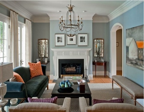
• Blue: Perpetuates feelings of calm and freshness. It’s a good fit for high traffic areas like kitchens and bathrooms.
• Purple: Connotes royalty and luxury. Purple is a great choice for formal living rooms or master bedrooms because it adds an air of lush sophistication.
• Gray: Gives a sense of relaxation and serenity. Use gray in spaces like home offices or bathrooms.
• Brown: Like green, brown’s natural appearance give it a relaxing touch. Choose it for rooms where the family gathers and furniture groupings that will incite conversation.
• Black: An assertion of power. Use black for statement pieces that you want to draw the eye.
• White: Relates a sense of cleanliness and purity. It is great for defining a space, but use white in conjunction with other colors since too much reads as sterile.
Don't forget that, when you choose which colours to include in your interior, three picks are better than one. Choose a neutral for the largest items like walls and flooring, a calmer colour for furniture and other sturdy items. Then, pick a third more dramatic colour to pop in your statement.
Entertainment of Monday, 19 June 2017
Source: Harmony and Charm
Lifestyle: The colour you choose affects your mood
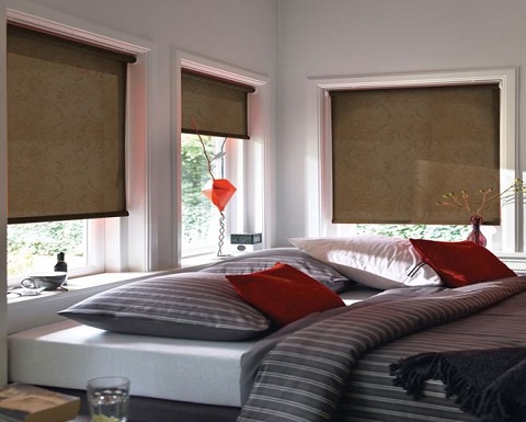
 Colours we choose for our interior decoration can affect our emotions and perceptions


, Bernard Antwi Boasiako")